

If Excel feels like a static grid of rows and columns, Pivot Tables are the engine that turns that grid into a powerhouse. While most users know how to create a basic table, true pros use them to build dynamic, automated dashboards.
Here are 10 advanced hacks to transform your data analysis.
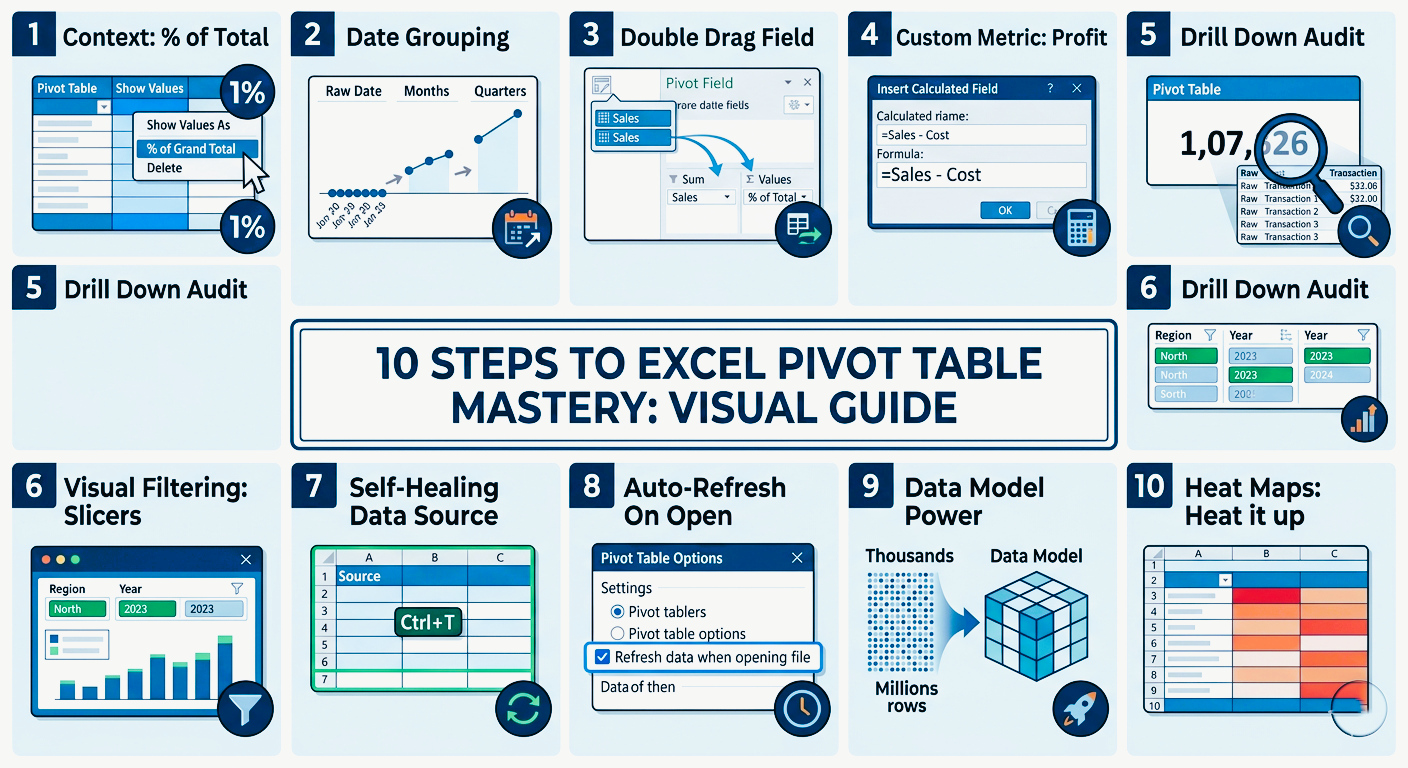
1. Contextual Analysis with “Show Values As”
Standard sums are useful, but context is more powerful. Instead of just seeing “what happened,” you can see “how it performs relative to everything else.”
The Hack
Right-click any value → Show Values As
Key Options
% of Grand Total – Identify top contributors
% Difference From – Compare periods instantly
Running Total In – Track cumulative growth over time
Rank Smallest to Largest – Instantly spot top and bottom performers
2. Smart Grouping (No Helper Columns Needed)
Let Pivot Tables handle grouping automatically.
Dates
Right-click date → Group → Select Months, Quarters, Years
Numbers
Group values into ranges like 0–100, 101–200 for distribution analysis
Manual Grouping
Select items → Right-click → Group to combine categories like regions
3. The “Double-Drag” Technique
Drag the same field into Values twice to analyze it in multiple ways.
Example
Sales as Sum + Sales as % of Total
This shows both absolute performance and market share in one view
4. Custom Logic with Calculated Fields
Build formulas directly inside Pivot Tables instead of outside.
Path
PivotTable Analyze → Fields, Items, & Sets → Calculated Field
Example
= Sales * 0.10 (for commission calculations)
Note
Calculated fields work on aggregated data, not row-level data.
5. Instant “Drill Down” Auditing
Quickly inspect any number in your Pivot Table.
The Hack
Double-click any value
Result
Excel creates a new sheet showing all source rows behind that number
6. Slicers & Timelines (Dashboard Control)
Replace dropdown filters with visual controls.
Slicers – Best for categories like Region or Product
Timelines – Best for date filtering with a slider
Pro Tip
Right-click slicer → Report Connections to control multiple Pivot Tables at once
7. Build Self-Healing Data Sources
Avoid fixed ranges like A1:D500.
The Fix
Convert data into a table using Ctrl + T before building your Pivot Table
Benefit
New rows are automatically included after refresh
8. Automate Refresh Logic
Stop manually refreshing your Pivot Table.
Steps
Right-click Pivot Table → PivotTable Options → Data
Enable “Refresh data when opening the file”
9. Use the Data Model for Large Datasets
Handle massive data more efficiently.
The Hack
Check “Add this data to the Data Model” when creating the Pivot Table
Benefit
Faster performance and access to advanced calculations like Distinct Count
10. Clean Up with Conditional Formatting
Make Pivot Tables visually insightful.
Steps
Apply Conditional Formatting → Color Scales
Ensure rule is set to “Apply to all cells showing values”
Final Thoughts
Pivot Tables are more than a reporting tool—they are a full data analysis system. Once you master grouping, calculated fields, slicers, and the Data Model, you move from basic Excel user to true data analyst level.
The real power of Excel isn’t in the data—it’s in how fast you can transform it into decisions.